Over the past few months, we’ve been heads-down building Mint Invoice, an invoice & billing app designed specifically for small businesses, local vendors, and anyone tired of clunky, overbuilt tools.
In this mini-series, we’re pulling back the curtain on the lessons, mistakes, and “aha” moments that shaped the product. No fluff, just real product decisions, real feedback, and real growth.
Simplicity > Everything.
Here’s what we learned about keeping things easy and why it matters more than you think.
The Goal: Radical Simplicity
When we set out to build Mint Invoice, our mission was clear but daunting: How do you simplify invoicing for people who dread it?
We spoke to dozens of small business owners, vendors, freelancers, and shopkeepers, and heard the same frustrations:
- “I spend more time filling forms than serving customers.”
- “Why does everything require 10 clicks?”
- “I just want to send a bill and move on.”
Most tools were over-engineered, built for accountants with spreadsheets and endless dropdowns. For the solo entrepreneur juggling orders, customers, and chaos, these apps added stress, not value.
The Mistake: We Overdesigned (And It Backfired)
Eager to impress, we packed Mint Invoice’s first draft with every feature under the sun:
- Customizable templates with 50+ color schemes.
- Analytics dashboards tracking “invoice open rates” and “client engagement.”
- Auto-tax calculators, multi-currency converters, and inventory sync for “seamless workflows.”
We thought we were building a Swiss Army knife. Turns out, we’d created a Rube Goldberg machine.
The Wake-Up Call: Users Hated It
During our first round of user testing, reality hit hard.
A food cart owner in Manila stared at the screen, confused: “Where’s the ‘Send Invoice’ button? Is it under ‘Financial Ecosystems’… or ‘Monetization Hub’?”
A freelance photographer in Lagos sighed: “Why do I need to fill 8 fields just to bill a client? I already know their name!”
And a flower shop owner in Lisbon said bluntly: “I don’t care about dashboards. I care about getting paid before the roses wilt.”
The feedback was unanimous: Our app was in the way.
The Pivot: Starting Over with Radical Simplicity
We scrapped the prototype and went back to basics. For weeks, we:
- Shadowed users: Watched how a baker scribbled orders on napkins.
- Mapped frustrations: Noted every sigh, eye-roll, and muttered “ugh.”
- Asked one question: “What’s the smallest thing this app could do to help?”
The answer? Remove, remove, remove.
What Emerged: The “No-Thinking” Invoicing App
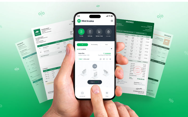
1. One-Tap Invoicing
No templates. No categories. Just three fields:
- Who? (Client name)
- How much? (Amount)
- Send. (One click)
Behind the scenes, the app auto-adds timestamps, saves drafts, and even suggests recurring clients, all invisible to the user.
2. Smart Billing Tokens
For vendors managing queues (like food stalls), we created digital tokens.
- Customers get a numbered token via SMS.
- Vendors tap a token to mark it “paid” or “ready.”
- No shouting. No paper slips. Just a silent, stress-free queue.
3. Background Magic
- Cloud sync works automatically, no “Save” buttons or login prompts.
- Offline mode kicks in seamlessly if the internet drops.
- Auto-reminders gently nudge clients to pay, without users lifting a finger.
4. The “Anti-Dashboard” Home Screen
Instead of graphs and widgets, the home screen is a to-do list:
- Unpaid invoices (tap to remind).
- Drafts (tap to send).
- Today’s earnings (big, bold numbers).
The Philosophy: Design for “One-Handed” Moments
Every design decision passed a ruthless test: “Could someone use this while holding a toddler, a coffee, or a sizzling pan of tacos?”
We deleted jargon, replaced menus with large buttons, and used voice-to-text for folks who’d rather speak than type. Even the color palette was stripped down to reduce visual noise.
The Lesson: Simplicity Isn’t a Feature, It’s the Product
We learned that ease of use isn’t a bonus, it’s the entire point. Users didn’t need more options; they needed fewer decisions.
As one user put it: “Mint Invoice doesn’t make me feel stupid. It feels like a helper, not another app to manage.”